Lab 3

- Based on good UI design principles, describe how you would construct various screens for your contextualised app idea from last week.
- Use screen shots from existing apps to illustrate your ideas.
- Two pages maximum including images.
Exercise
Reading over the notes on Week 3, UI designed, I can see we were given 5 rules to follow in order to design good interfaces for the applications. These rules allow the developers to create consistent and easy to use screens that most end-users will be able to navigate without any problems.
Principles of Good Interface Design
- It’s all about the user experience (not just the functionality!)
- Make the right things visible (hide unnecessary information)
- Show proper feedback to the user
- Make the application predictable and intuitive
- Be tolerant of user mistakes
Given the (possible) application to be built on Lab 2, I would create a very simple main screen. The application would be a phone interface to the website Hit The Road and when logging into the website, their interface is very simple. As a user of the site there are only two inputs;
- From:
- To:
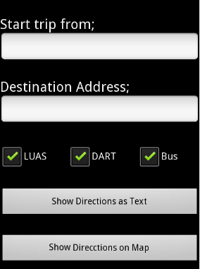
The screen is simple in its design, it asks the End-User for initial address, this could be auto-completed using the phone's GPS; thus helping tourists that are not familiar with Dublin.
Then the destination address is entered and a menu will display the correctly stored locations, similar to what car GPS units do; as you type it narrows down the location to match the database information.
The user can de-select the transport method. At the moment the Leap Card is being introduced in Dublin, so some users will be OK using all three transport methods, but there are people using other alternatives, like seasonal tickets for LUAS or DART, and they may prefer those over Dublin Bus, or vice versa.
Lastly, the user can select either a MAP view, or the TEXT directions, this again is to accommodate the End-Users; tourists may have a map with them, where they can draw; some people may prefer to write the directions on a paper, so they can use them as reference while on the trip. For example, when taking multiple transports, rather than having to refer to the mobile phone constantly.
Other less frequently used options like getting a text message with the directions - not everyone has paper and pen on hand, could be set-up under the Settings menu. The settings menu could also control the transport method check boxes, so a frequent user doesn't have to un-check the option every time.